When doing web development on the desktop, you have the benefit of inspection and debugging tools available in modern browsers like Chrome, Firefox, Safari and Internet Explorer. Inspecting web traffic for page requests and API calls is relatively straightforward. Once you move over to mobile development, you miss a lot of those built-in tools. Luckily there are some good desktop network proxy tools which can make mobile traffic inspection possible again.
In this post I’ll walk through setting up an Android 4.x device with Fiddler running on a Windows PC. Fiddler is a powerful HTTP/HTTPS proxy utility that is pretty easy to set up and use for this type of analysis. And it’s free. (Mac users could use similar steps with the Charles web debugging proxy; it’s not free but does have a free trial and is relatively inexpensive.)
Once we have this set up, some typical use cases include:
- Mobile web development or performance measurement
- Mobile app development or debugging
- Observing other apps on your phone to understand network connections being made or for security analysis
Prerequisites
As prerequisite, you should install Fiddler and be somewhat familiar with how to use it. If you haven’t used it before, check out the features tour on the Fiddler website.
The Android device should be on the same network as the Windows PC. The PC doesn’t have to be on Wi-Fi, as long as they can connect to each other. (If in doubt, trying pinging from the Windows PC to the Android device to verify the local network connection.)

Android device (on Wi-Fi) and the Windows PC on the same network
Set up Fiddler
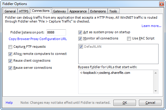
After Fiddler is installed, configure it to allow remote connections and to decrypt HTTPS traffic:
- Click menu Tools | Fiddler Options, then select the Connections tab
- Make note of the “Fiddler listens on” port (normally it’s 8888)
- Make sure the check box for “Allow remote computer to connect” is checked
- Switch to the HTTPS tab
- Make sure the check boxes for “Capture HTTPS Connects” and “Decrypt HTTPS traffic” are both checked
- Restart Fiddler
- Make note of the PC’s IP address
- Close non essential apps on the Windows PC (to minimize web traffic being routed through Fiddler)

Fiddler connection options (click to enlarge)
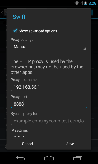
Set up Android Networking
Now we’ll set up the Android device to connect to the Fiddler proxy. These instructions should work for most Android phones or tablets on OS 4.0 and newer. (If your device doesn’t work or needs slightly different steps, you can search Google for your-phone-model http proxy.)
- Tap on Settings, then Wi-Fi
- Find the network on which you’re connected (normally the first one listed), then tap and hold
- Choose Modify network from the pop-up
- Scroll down and enable “Show advanced options”
- Change “Proxy settings” to Manual
- Under “Proxy host name” enter the Windows PC IP address from above
- Under “Proxy port” enter the Fiddler port from above (usually 8888)
- Tap Save and wait a moment for the network to reconnect

Android proxy settings (click to enlarge)
Google Chrome Settings
Added 2014-06-06: Thanks to Stack Overflow user comfreek who pointed out this issue with Chrome proxy settings.
On newer versions of Google Chrome for Android, there are new settings for Bandwidth Management. When bandwidth management is enabled (which I believe is the default), HTTP traffic will go through Google proxy servers rather than the customer HTTP proxy we are setting up here.
You’ll need to make sure bandwidth management is turned off:
- Launch Google Chrome
- Go to Settings, then under Advanced tap on Bandwidth management
- Turn off Preload webpages and Reduce data usage
Set up Android Networking
Now we’ll set up the Android device to connect to the Fiddler proxy. These instructions should work for most Android phones or tablets on OS 4.0 and newer. (If your device doesn’t work or needs slightly different steps, you can search Google for your-phone-model http proxy.)
- Tap on Settings, then Wi-Fi
- Find the network on which you’re connected (normally the first one listed), then tap and hold
- Choose Modify network from the pop-up
- Scroll down and enable “Show advanced options”
- Change “Proxy settings” to Manual
- Under “Proxy host name” enter the Windows PC IP address from above
- Under “Proxy port” enter the Fiddler port from above (usually 8888)
- Tap Save and wait a moment for the network to reconnect
Android proxy settings (click to enlarge)
Web Browsing
On the Android device, bring up a browser like Chrome and visit a website like http://bing.com. If everything has been set up correctly, you should see the HTTP traffic flowing through Fiddler. You can click and inspect each of the network requests, for example the HTML page, CSS, JavaScript, and images.

Example capture of Bing mobile website through Fiddler
Now let’s try a website that forces HTTPS, for example https://wellsfargo.com. In this case the mobile browser is complaining that it can’t validate the SSL certificate from the server. This is accurate because we’re using Fiddler as a proxy and it’s generating its own SSL certificates for us on the fly. (This is what allows Fiddler to decrypt and inspect these HTTPS connections.) We’ll come back to this in a bit.
Caution: I recommend not choosing the “proceed anyway” option here. Mobile browsers tend to cache that choice for a long team, meaning that you won’t be warned about it again in the future.

Chrome browser warning about unverified SSL certificate
Install Fiddler Certificate to Android
As a final step to improve the debugging of secure HTTPS connections, we can install a Fiddler “root” certificate on the Android device. (Note: If your device does not already have a PIN or password, you will need to set one up before installing the certificate.)
Steps:
- On Android start the Chrome browser
- Navigate to http://ipv4.fiddler:8888/
- Tap on the link for the “Fiddler Root Certificate”
- Name the certificate “Fiddler” and install it (entering your PIN or password if prompted)
With this test certificate installed, you should now be able to visit SSL sites from the Android Chrome browser and not receive any certificate warnings. The network traffic should also be viewable in Fiddler. Good test sites are those which always force secure HTTPS connections, like the Wells Fargo mobile site at https://wellsfargo.com/.
Return to Normal Android Networking
When you’re done with your Android→Fiddler testing, remember to restore your normal Android network settings. Otherwise you may be confused later when none of your apps work 🙂
- Tap on Settings, then Wi-Fi
- Find the network on which you’re connected (should be the first one listed), then tap and hold
- Choose Modify network from the pop-up
- Scroll down and select (enable) “Show advanced options”
- Change “Proxy settings” to None
- Tap Save and wait a moment for the network to reconnect
- Go up a level in settings to Security
- Tap Trusted credentials, then select the User tab
- Tap on the Fiddler “Do not trust” certificate, then scroll down to remove it
- You may need to power cycle your device to get all apps to forget about the Fiddler certificate (e.g., the Chrome browser will continue to try to use it for a while


 Samwebman's Blog